Brand Identity · Visual System
Locket
Step into your Memories
- Role
- Brand & Visual Designer
- Year
- 2026
About the project
Locket is an app for people who live away from where they grew up — it leaves memories in the places they happened, so those places can find you again. The product idea was emotional and quiet, so the identity had to be too.
I built the visual system from nothing: positioning the brand on a mood spectrum, deriving a palette from reference imagery, pairing type that felt warm without feeling dated, and drawing a wordmark that carries the central metaphor in a single letter.
Direction
Three attributes, decided first
I positioned the brand on a mood spectrum — each row a visual axis, from Necessity/Luxury to Clinical/Personal. The chosen positions clustered consistently, and those clusters became the three attributes every later decision had to answer to.
Soft, unhurried, never heavy — even though the subject is loss.
One idea per screen. Nothing competing for attention.
Warm and hand-considered, not clinical or corporate.
Mood board

Color palette
The color system came out of a full tonal spectrum derived from the mood board, then narrowed to the core values that best reinforced the three attributes. Terracotta carries the warmth; the deep brown grounds it; the near-neutrals keep everything quiet around them.
Typography
One serif, one sans — chosen to balance emotional warmth against screen-friendly clarity. I shortlisted from a longer set (Lora, Playfair Display, EB Garamond, Crimson Pro, Spectral) and chose on personality first, legibility second.
Merriweather
Headings
Designed for on-screen reading. Its bracketed serifs evoke editorial warmth without feeling dated, reinforcing the personal, nostalgic qualities of the brand.
Nunito Sans
Body & UI
Slightly rounded humanist terminals give it a warm, personal feel where most sans-serifs read as cold or corporate. Holds clarity at small sizes.
| Style | Typeface | Weight | Size |
|---|---|---|---|
| Header 1 | Merriweather | Semibold | 26px |
| Header 2 | Merriweather | Medium | 22px |
| Header 3 | Nunito Sans | Medium | 18px |
| Header 4 | Nunito Sans | Medium | 16px |
| Body | Nunito Sans | Light | 16px |
| Tag | Nunito Sans | Regular | 20px |
| Button | Nunito Sans | Regular | 18px |
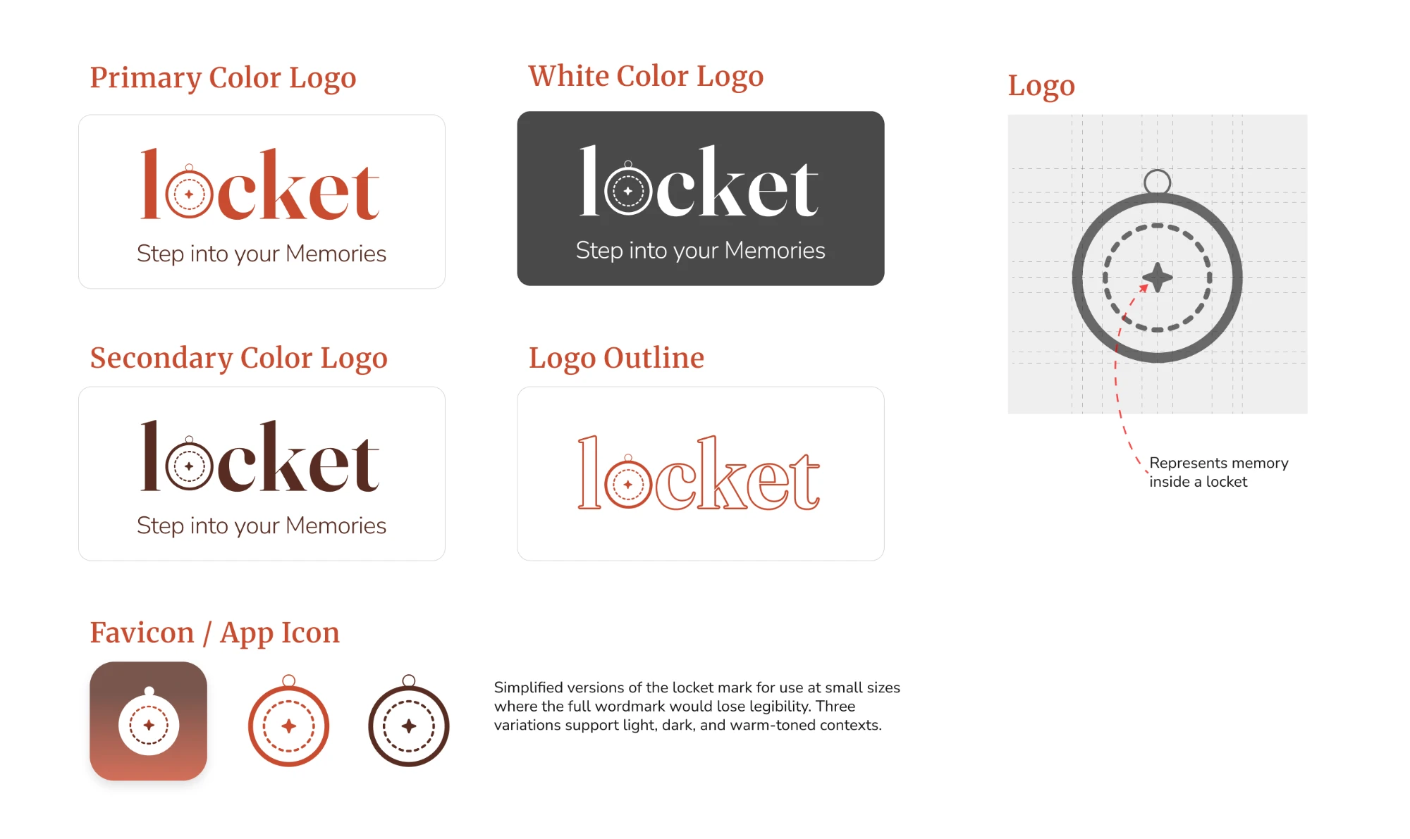
Logo variations
Where the mark came from
The logo embeds the brand's central metaphor directly into the wordmark. The letter “o” is replaced with an illustration of a locket — treating the logo itself as a small ritual object you open to reach your memories.
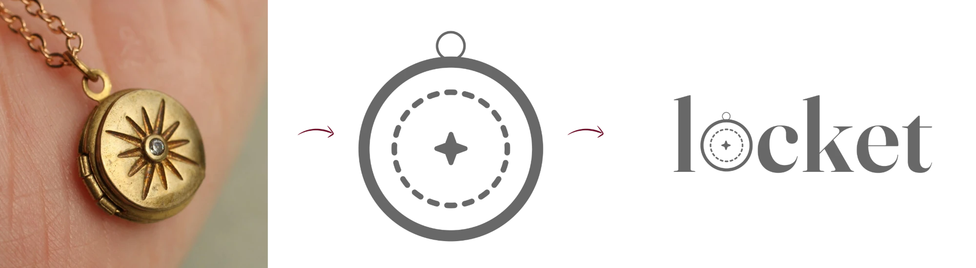
Built on a circular grid to hold proportional integrity at every scale, with a small radial dot inside the locket suggesting the memory glowing within.
System rules
Buttons
Three tiers — primary, secondary, tertiary — for clear hierarchy, each with a disabled state. Generous corner radii and warm fills carry the inviting, hand-considered quality through to the interface.
Spacing
A four-column grid with generous padding and consistent gutters, so every screen keeps its breathing room and the brand's quiet, unhurried pace survives contact with real content.
Brand in context
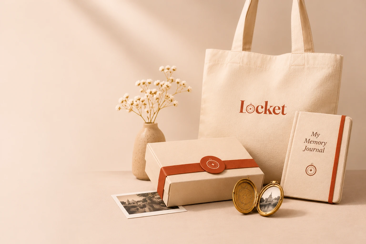
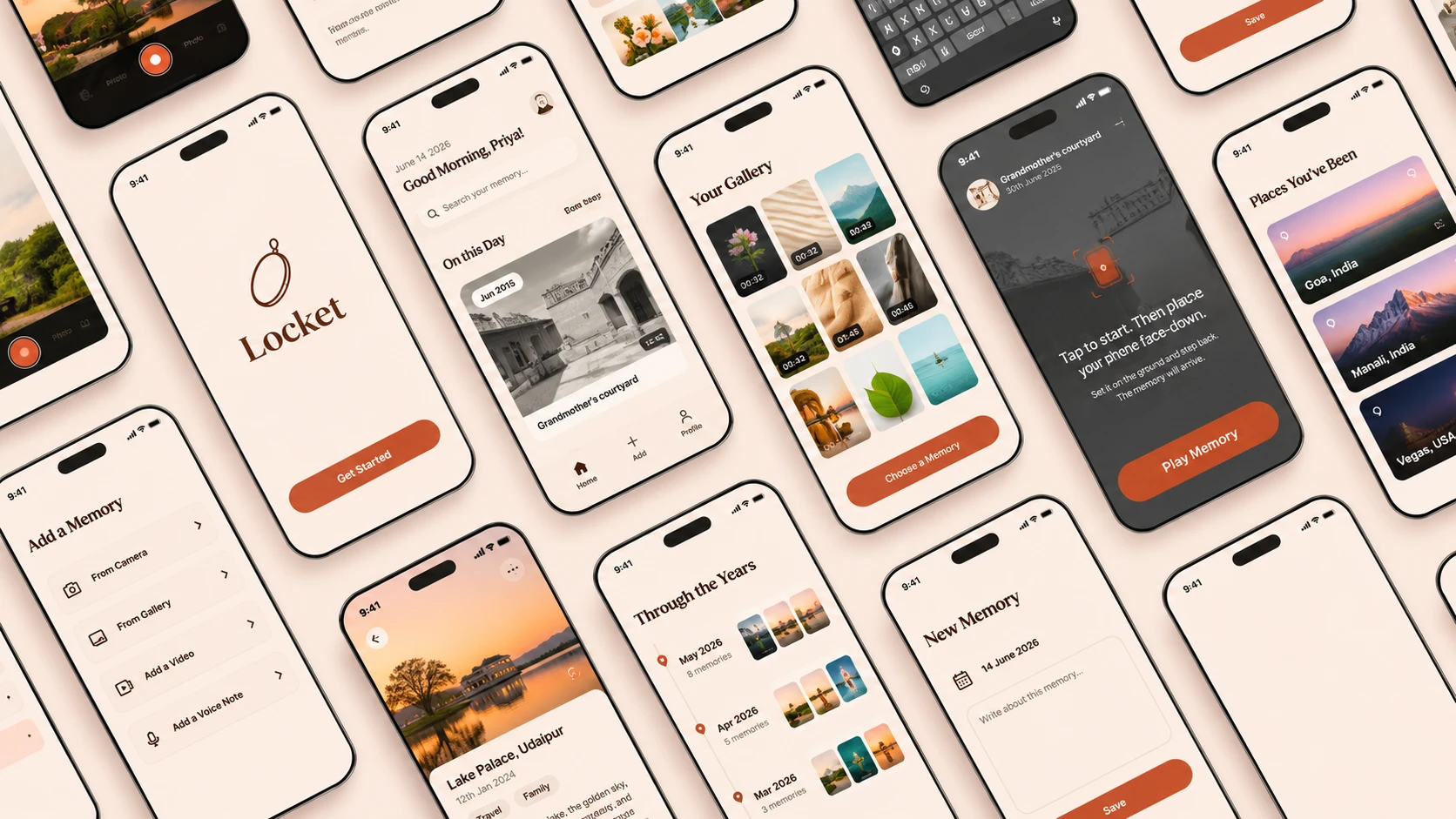
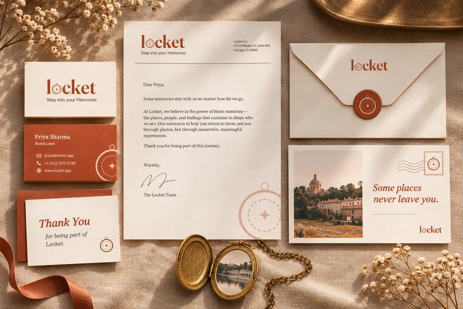
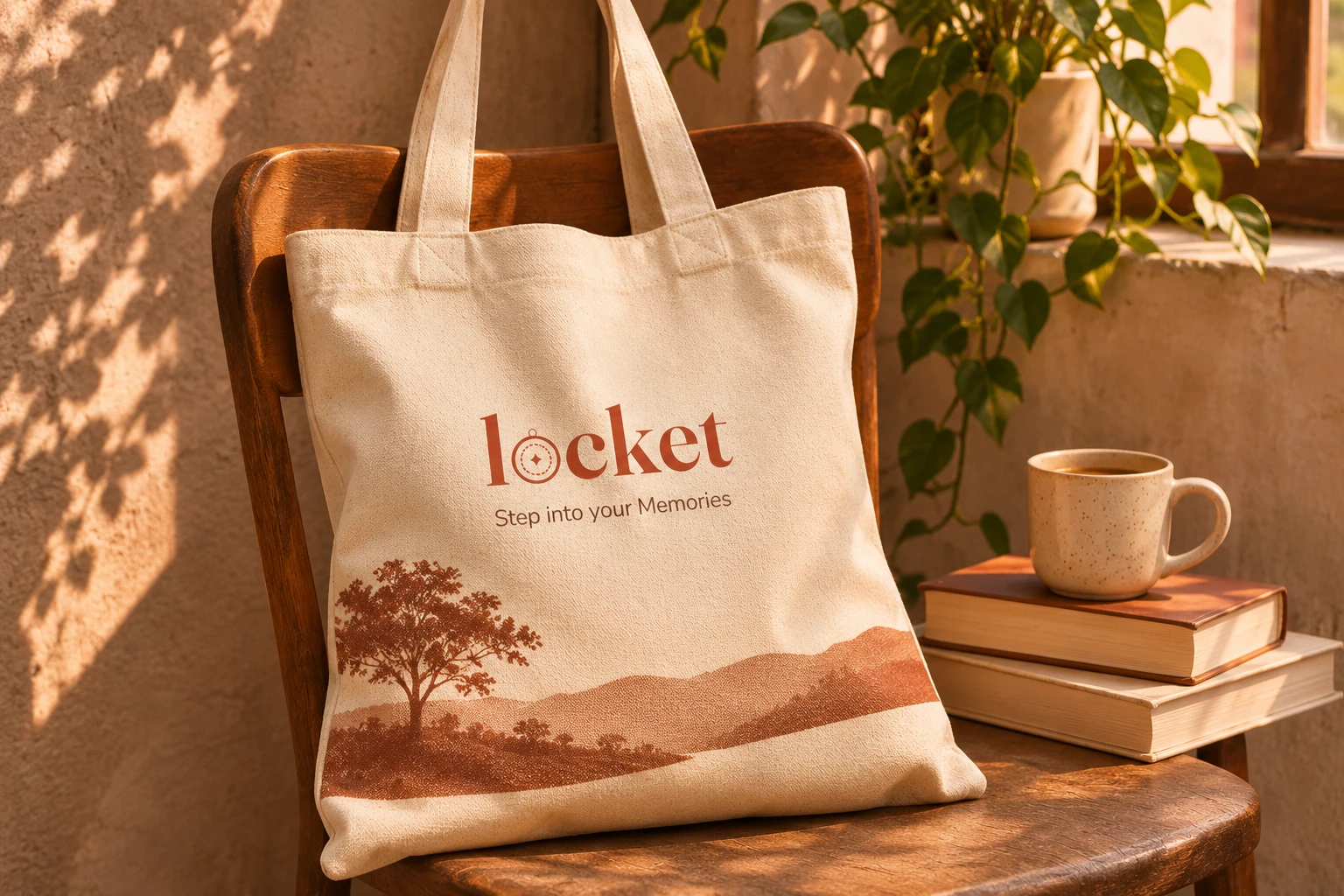
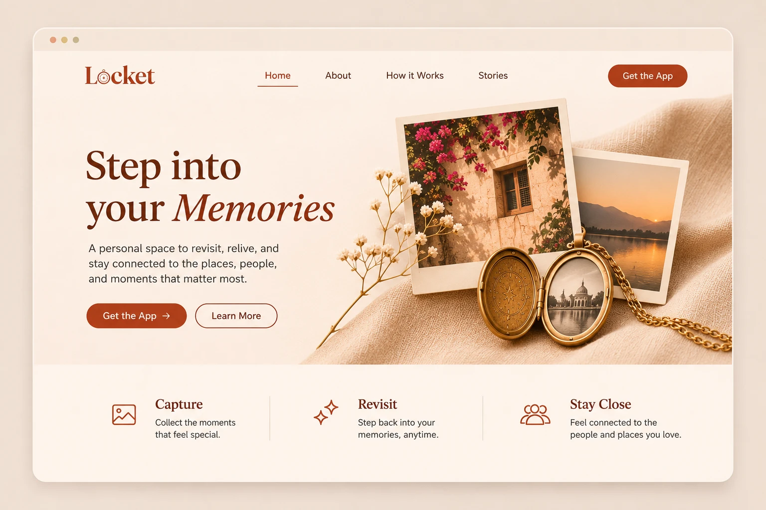
I applied the finished system to real surfaces to test whether it held together across scales — from a wax seal and a letterhead to a canvas tote and a full web page.
Reflection
What worked
Fixing the brand on a mood spectrum before touching colour kept every later decision answerable to one question: does this feel like a kept thing, or a new one?
Deriving the palette from reference photography rather than picking swatches gave the terracotta and cream a reason to sit together.
Putting the metaphor inside the wordmark — the locket in place of the “o” — meant the logo does the explaining, so the rest of the system could stay quiet.
Testing the mark at a 25 mm tag before a shop window caught the detail loss early, while the drawing was still cheap to change.
Would do differently
I designed the palette for light surfaces first and retrofitted the dark UI later; building both from the start would have avoided re-deriving half the tints.
The type scale was set on desktop widths and squeezed on small screens — I would set the mobile end of the ramp first next time.
I drew the illustration pieces as finished artwork rather than as a kit, which made them harder to recombine for surfaces I had not anticipated.
Next steps
Write the system up as a usable set of rules rather than a showcase — what to do with the mark at small sizes, on photography, and in a single colour.
Extend the palette into states the product needs but the brand did not: error, disabled, and the quiet confirmation of something saved.
Test the wordmark with people who would actually use the app, to find out whether the locket reads as a locket without the name beside it.
Biggest learning
This started as a very open brief. There was no spec, no client, and no clear edge to the problem, which made it tempting to design everything at once. What actually moved it forward was narrowing: deciding what this brand had to do before deciding what it should look like. Once I had pinned down the few things that were genuinely required, the rest of the system almost chose itself. I came away trusting that part of the process more than any single design decision in it.