Academic Project · Mobile Design
Constant — A journaling app built for stressed students
A habit-forming journaling app designed to help students manage stress and build emotional resilience — through guided reflections, mood tracking, and small daily wins.
Role
End-to-end UX Design
Timeline
16 Weeks
Type
Academic Project
Tools
Figma · Miro · ChatGPT · Gemini
Students are overwhelmed — and they deserve better support.
As academic demands continue to rise, students are experiencing record levels of stress — often without the time, tools, or support to manage their mental well-being. 87% of college students report feeling overwhelmed by their academic workload.
The opportunity isn't just awareness — it's accessibility. Students need tools that feel supportive rather than clinical, and that fit naturally into their already-busy routines. Constant was designed to be that — a gentle daily companion that meets students where they are.
The Gap
The data confirmed a mental health crisis hiding in plain sight
Secondary research surfaced a troubling pattern: students are struggling in large numbers, but the support infrastructure isn't reaching them.
The gap between need and access is enormous. Professional therapy isn't always reachable — students need a low-stakes, daily tool that meets them where they are.
Don't add to their load. Reduce it.
Constant makes stress management approachable through three core experiences — each designed around one principle: the smallest possible action that creates meaningful change.
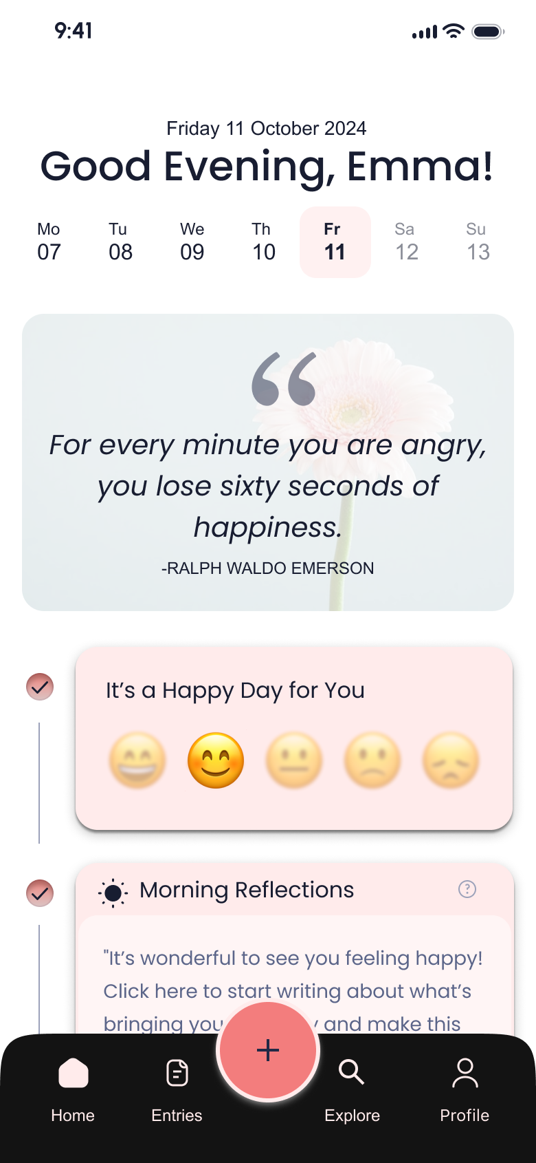
Guided Reflections
Morning and evening prompts reduce cognitive load and make journaling feel effortless — no blank page, no pressure.
Mood & Pattern Tracking
Simple mood check-ins that help users identify emotional patterns and triggers over time — turning data into self-awareness.
Rewards & Growth
Positive reinforcement through streaks and insights encourages consistency without guilt — progress that feels earned, not forced.
The App in Action
See how Constant turns a stressful moment into a quiet, meaningful habit
Prototype walkthrough · Figma
View Interactive PrototypeDesign Process
From lo-fi to launch-ready in five stages
Discover
- Screener survey
- Secondary research
- Competitive analysis
- Stakeholder interview
Define
- Affinity mapping
- SWOT analysis
- MoSCoW prioritization
- Hooked Model mapping
Design
- Information architecture
- User flows
- Lo-fi wireframes
- Style guide & UI kit
Test
- Hi-fi prototype
- Usability testing (6 students)
- 12 core tasks
- Issue documentation
Deliver
- Iterated UI designs
- Design system
- Handoff-ready prototype
- Before/after documentation
Design Strategy
Designing for habit formation, not just task completion
I applied Nir Eyal's Hooked Model as a design framework — not to make the app addictive, but to build genuine, healthy habits. Each product element maps to a stage that creates a positive feedback loop.
What brings the user back?
Internal trigger: feeling stressed, anxious, or lonely. External trigger: gentle, well-timed push notifications and reflection reminders — never intrusive.
The simplest possible behavior
Low-friction journaling with guided prompts. Morning check-in takes under 2 minutes. The barrier to start is deliberately minimal.
Fulfilling, yet leaves them wanting more
Curated content, mood insights, streak milestones, and a Rewards Market with affiliated brand discounts. Each session reveals something new.
What makes the next session better
Mood data, journal entries, and reflection history accumulate over time — creating a richer, more personalized experience with every use.
Research Insights
Three findings that shaped every design decision
Stigma prevents early help-seeking
Students wait until they're in crisis before seeking support. They need low-stakes, everyday tools that don't feel clinical or therapeutic — something they can reach for before things spiral.
Support should feel personal, not like another task
Students shared that they were more likely to engage when an experience felt designed around their emotional state. The design needed to feel like genuine support — rewarding and personal, not a wellness checklist.
Value must arrive in session one
Students abandon apps within 3 days if they don't see personal benefit. The app needed to deliver immediate, tangible value in the first session while laying the groundwork for long-term habits.
Institutional Insight
“35% of students here at Thomas Jefferson University seek stress-related help.”
Zoe Ann Gingold — Director, Office of Accessibility Services
This conversation with the university's accessibility director grounded the research in real institutional data — and confirmed that student mental health support has a significant reach problem, not just an awareness one.
Design Challenge
How might we help university students build emotional resilience through small, consistent daily actions — without adding to their mental load?
Prioritizing features by impact, not excitement
After understanding user needs and constraints, I used a MoSCoW framework to prioritize features — separating what the app needed to be credible from what would make it remarkable.
Must Have
- →
Personalized reminders via push notifications
- →
Notepad to freely write about feelings
- →
Progress tracking through streaks and milestones
- →
Mood tracking to log emotional well-being over time
- →
AI-driven pattern insights after multiple entries
- →
Onboarding guidance to orient new users
- →
Clear and transparent privacy policy
Should Have
- →
Streaks for daily journaling consistency
- →
Pre-written prompts for quicker, guided entries
- →
Photo attachments to enrich daily logs
- →
Morning and evening structured reflections
- →
Audio journaling for hands-free entries
- →
Offline journaling when not connected
- →
Flashbacks from this day last year
Design
From lo-fi sketches to a calm, habit-ready mobile experience
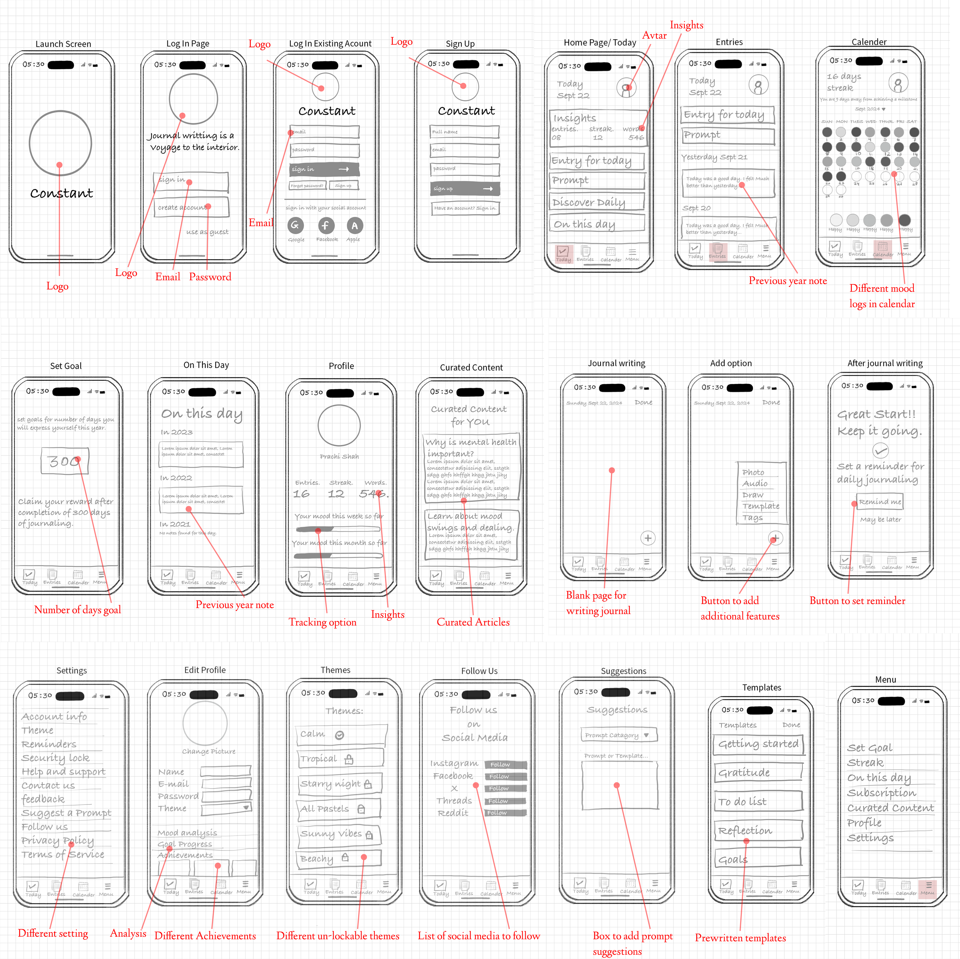
Lo-fi Wireframes
Low-fidelity wireframes mapped journaling flows, mood logging, and streak mechanics before visual polish — keeping the experience lightweight enough for daily use while still feeling trustworthy.
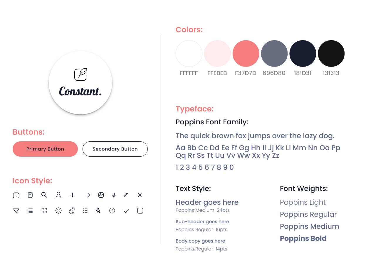
UI Exploration
Explored color, typography, and component patterns that feel warm and grounded — reinforcing emotional safety and consistency across journaling, insights, and gentle nudges without feeling clinical or overwhelming.
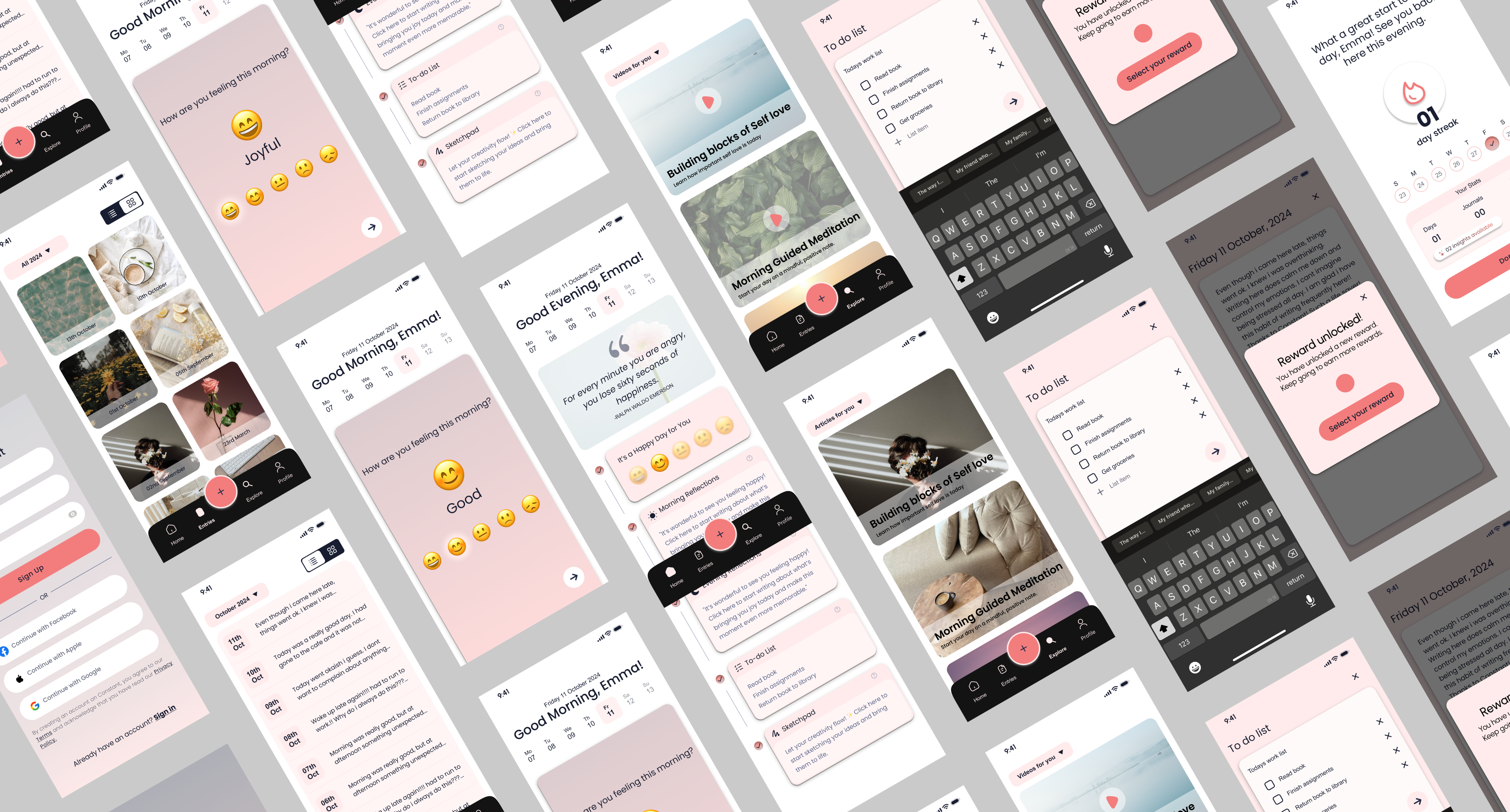
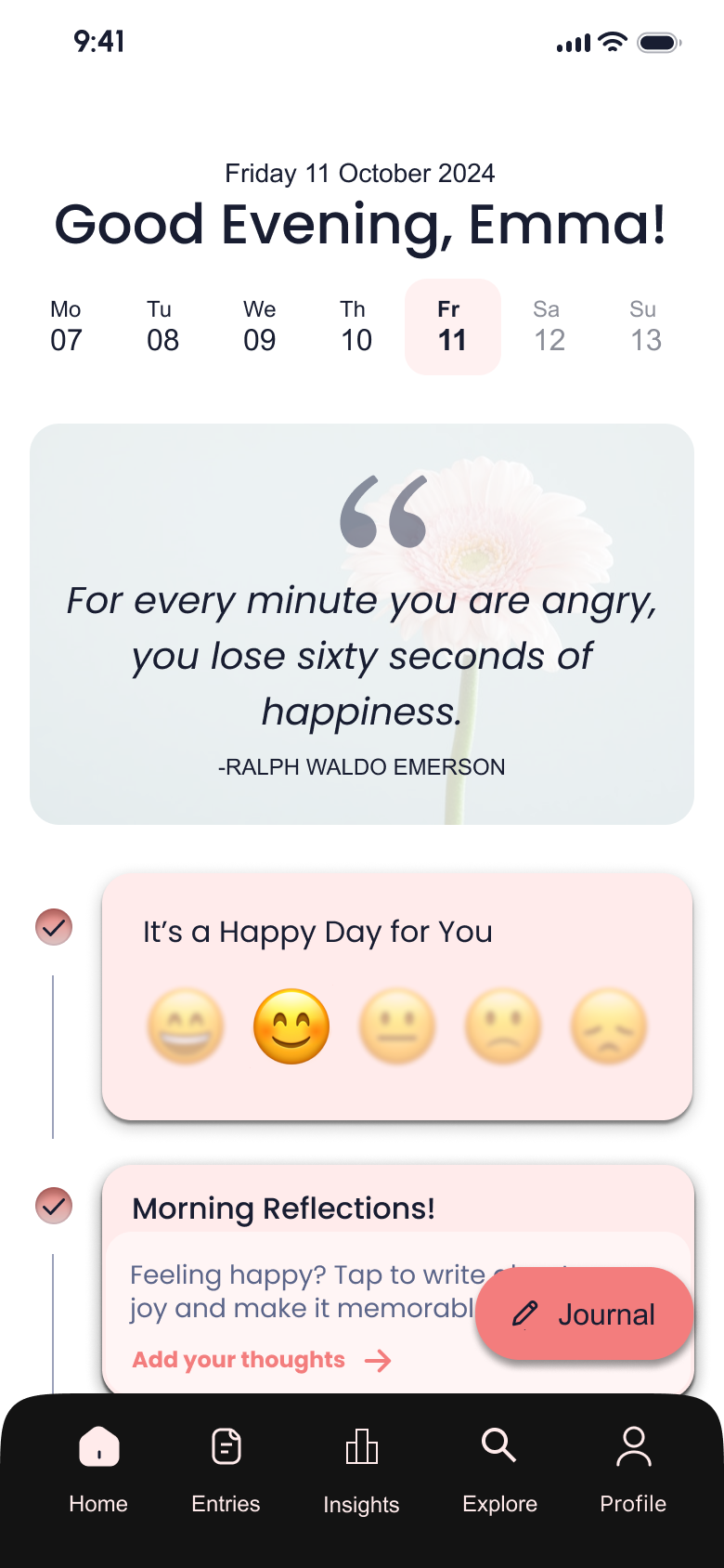
Hi-fi Wireframes
High-fidelity screens brought the habit loop to life — clear entry points, readable mood and streak summaries, and flows that supported reflection in minutes, not minutes of setup — ready for usability testing with students.
Usability Testing
Validated with real students, not assumptions
To validate the experience, I conducted moderated usability testing focused on functionality, clarity, and ease of use — asking participants to complete core tasks like mood tracking, daily reflections, and browsing curated content.
Additional Testing Data
Iterations
Three changes that made the biggest difference
I charted every usability issue by frequency and severity, then focused on changes that would resolve the most friction with the least disruption to the established design language.
Insights buried inside the profile section
Participants couldn't find their mood and journaling insights — they expected a dedicated space, not a settings-adjacent location.

What changed
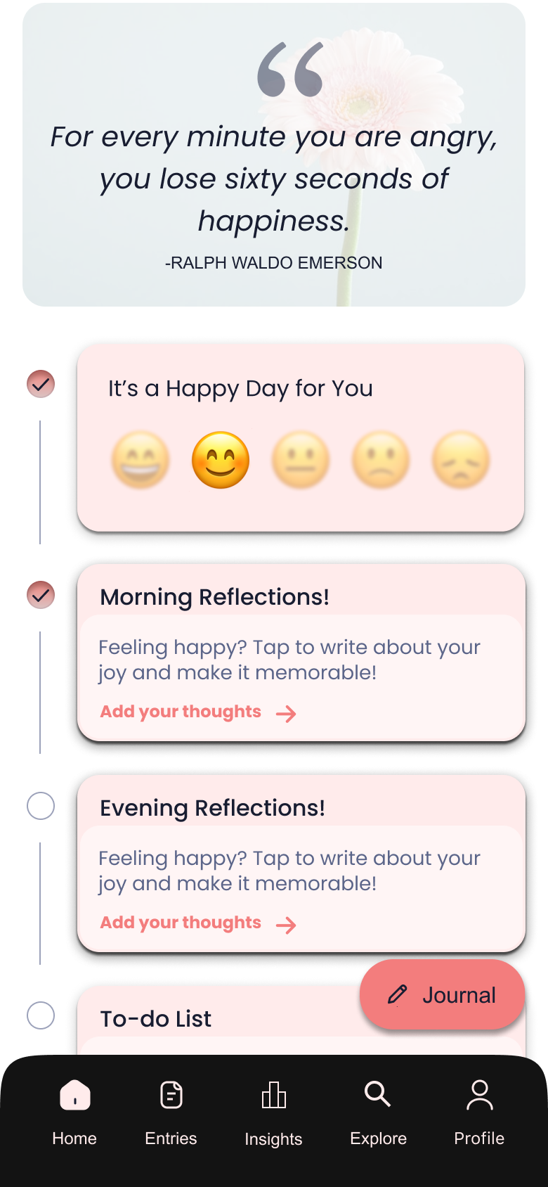
Separated Insights from the profile section and elevated it as its own navigation item, making it consistently discoverable from anywhere in the app.
The "Journal" entry point wasn't prominent enough
Participants were uncertain what the floating action button did — several tapped it hesitantly or missed it entirely during task flows.
What changed
The floating journal button was redesigned to be more visually prominent and explicitly labeled — removing ambiguity about its purpose and reducing time-to-first-entry.
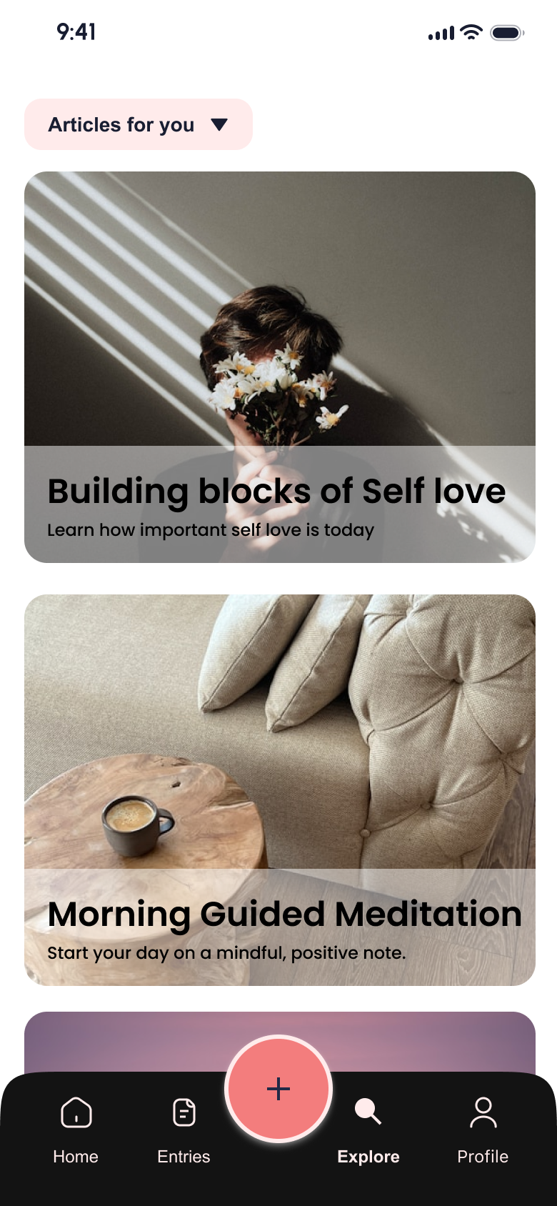
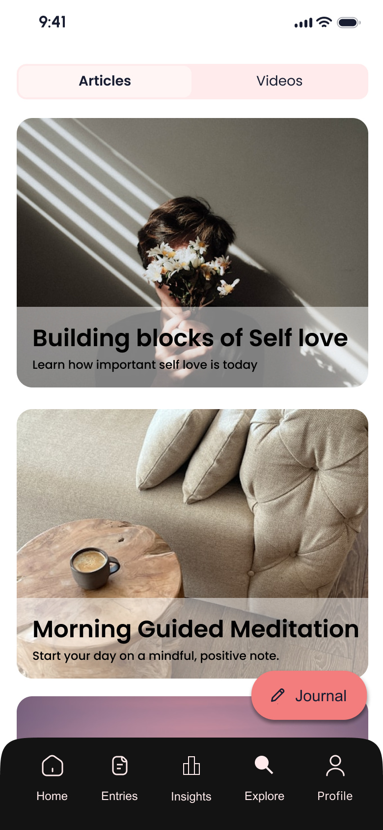
No clear signal to switch between articles and videos
Users didn't recognise that the curated content section contained video content alongside articles — the toggle affordance wasn't obvious enough.
What changed
Added clear visible text labels to indicate that users can switch to the videos section, replacing the icon-only pattern that tested poorly.
What Worked
- ↗
Applying the Hooked Model structured the experience around sustainable habit formation, not shallow engagement.
- ↗
Usability testing with students surfaced emotional and cognitive friction I wouldn't have found through solo review.
- ↗
Keeping the interface intentionally minimal reduced overwhelm and made repeat use feel effortless.
- ↗
Iterating based on real feedback strengthened the app's tone and approachability.
Would Do Differently
- ↻
Test habit loops over a longer period to better understand where users drop off after the initial sessions.
- ↻
Explore alternative notification triggers that feel more contextual and less intrusive.
- ↻
Validate emotional impact with follow-up studies beyond initial usability sessions.
Next Steps
- →
Expand testing to include students with different stress levels, schedules, and academic disciplines.
- →
Explore deeper personalization based on mood patterns and usage history.
- →
Measure long-term engagement to assess whether journaling habits are sustained beyond onboarding.
Biggest Learning
Behavior change happens through small, repeatable actions — not complex features. Designing for emotional well-being meant prioritizing consistency, trust, and low-effort interactions over productivity metrics or aggressive engagement tactics.
Next Project
Sharp Website Redesign
Design Systems · Atomic Design · Web Design