Academic Project · Web & E-commerce Design
Sharp — Making Setup Simple Through Interactive Support
Redesigning the Sharp Clocks website with e-commerce functionality and a virtual interactive clock that guides users through setup and troubleshooting in real time — reducing returns, support calls, and user frustration.
Role
End-to-end UX Design
Timeline
16 Weeks
Type
Academic Project
Tools
Figma · Miro · ChatGPT · Claude
A product people couldn't figure out — not because it was hard, but because the guidance wasn't there.
Sharp sells digital alarm clocks primarily through Amazon and Target. While the team focused on redesigning the e-commerce experience, a deeper problem emerged: customers were abandoning their products or leaving negative reviews — not because the clocks were faulty, but because the text-heavy manual was confusing and hard to follow.
My focus: make technical support more accessible and visual — by designing an experience that meets users where they are and guides them through setup step by step.
The Gap
Three pain points hiding in plain sight — in customer reviews
Research from Amazon and Target reviews revealed a consistent pattern: users were struggling with the same issues, repeatedly.
Low Manual Engagement
Users skipped the text-heavy manual entirely, leading to setup frustration and negative reviews like "Can't figure out how to set the time."
Confusing Instructions
Non-tech-savvy users — the primary audience of seniors and parents — found instructions difficult to follow without any visual guidance.
High Return & Support Volume
Customers contacted support or returned products for issues that could have been resolved with clear, guided setup instructions.
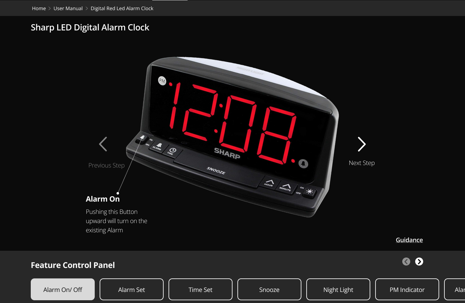
An interactive product replica that teaches by doing.
The Virtual Clock lets users click buttons on a digital replica of their physical clock and immediately see what each button does — mirroring real-world interaction with contextual, step-by-step guidance.
Clickable Buttons
Users click buttons on the virtual clock to see what each one does, mimicking real-world interaction without touching the physical product.
Contextual Guidance
Each button click reveals step-by-step instructions specific to that feature — e.g., "Night Light On" shows exactly how to toggle it.
Integrated Support
Quick access to video tutorials, FAQs, and customer support — all without leaving the page, reducing friction at every step.
The Virtual Clock — In Action
Click a button. See what it does. No manual required.
Interactive prototype · Figma
View Interactive PrototypeDouble Diamond — from broad problem to focused solution
I followed the Double Diamond framework — Discover, Define, Develop, and Deliver — to guide the process from initial research to implementation. Each phase helped narrow a broad set of pain points into one clear, purposeful opportunity.
- →Sharp website audit
- →Mobile experience review
- →Amazon & Target review analysis
- →Manual evaluation
- →User personas
- →MoSCoW prioritisation
- →Value proposition
- →Journey mapping
- →Information architecture
- →Sitemap
- →Lo-fi wireframes
- →UI kit & style guide
- →Prototype walkthrough
- →Usability testing
- →Task analysis
- →Issue identification
- →Hi-fi wireframes
- →Design system
- →Iterated UI
- →Handoff documentation
Discover
The problem wasn't just online — it was in every review
Analysing Sharp's existing website revealed limited brand presence, missing product listings, and no social media activity. But the most telling research came from the customer Q&A sections on Amazon and Target.
Website Audit Findings
Limited brand information
The site provided almost no context about Sharp as a company or brand.
Incomplete product catalogue
Many Sharp products were entirely absent from the website listing.
No social media presence
Zero active social channels — a missed opportunity for user engagement.
Real Customer Questions — Amazon & Target
These are real questions posted by Sharp clock customers. The pattern was impossible to ignore.
“When you set the time, can you go forward or backwards to easily just go earlier a little without having to go all the way around?”
— Phil, Dec 2017
“How do you adjust the LED dimmer?”
— JC, Jul 2018
“How do you set the time?”
— Sho, Dec 2017
“Can the night light be turned off?”
— IGP, Jun 2020
“Does the red dot mean PM or AM?”
— Sleepy Head, Mar 2020
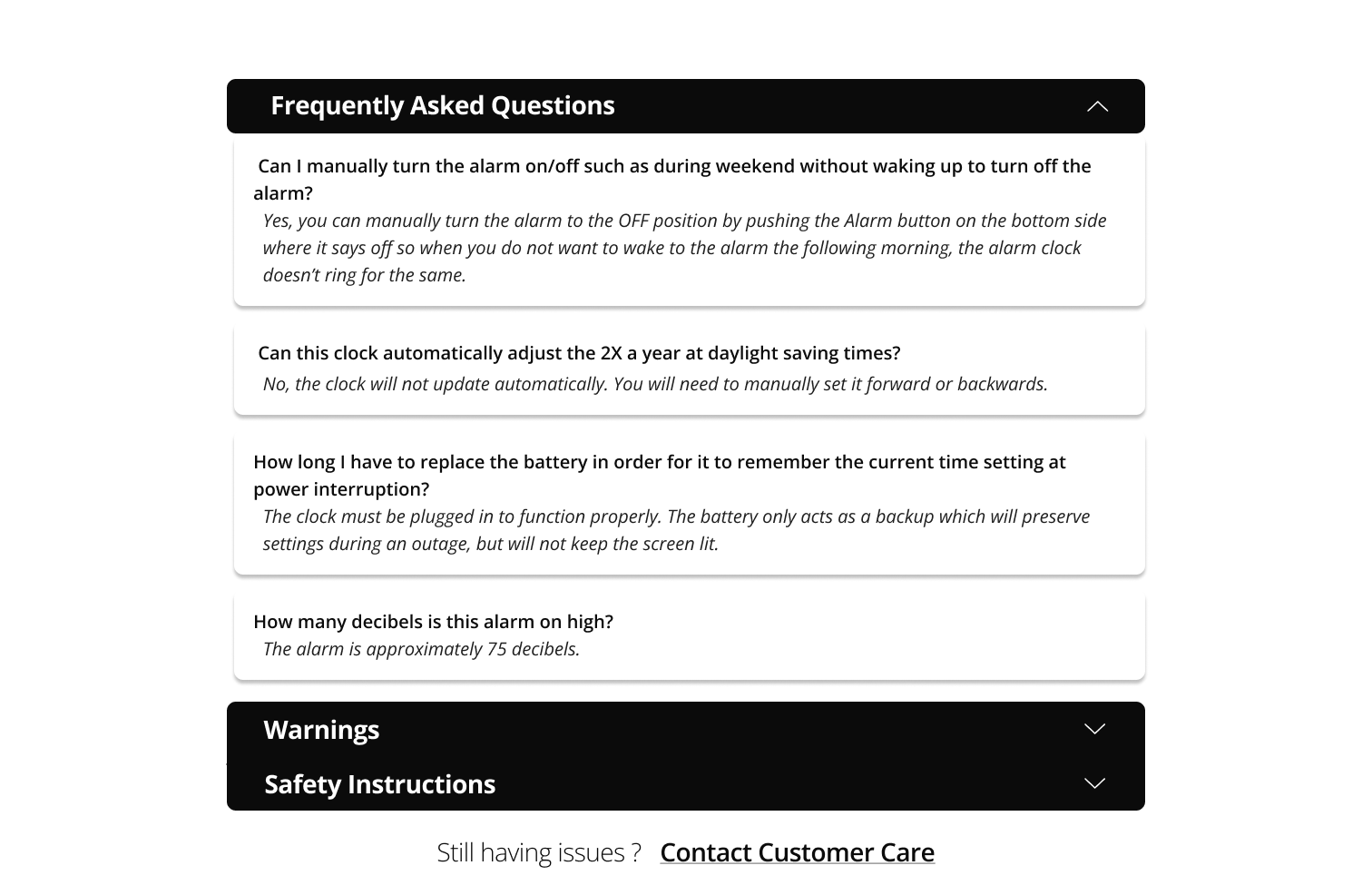
“Can I manually turn the alarm on/off during weekends without waking up to turn it off?”
— llc812, Mar 2021
The Existing User Manual
Existing Manual — Key Limitations
- →
Heavily text-based with no visual guidance
- →
Instructions are difficult to follow, especially for non-tech-savvy users
- →
Engagement is low — many users skip the manual entirely
- →
Updates or revisions to printed content are slow and inefficient
Design Challenge
How might we help Sharp customers successfully set up and use their products — without relying on a printed manual?
Research Insights
Three insights that shaped the design direction
Users learn by doing, not by reading
Customers interacted with their clocks first and consulted instructions only when stuck. Any support solution needed to meet them in that moment — not before it.
Visual guidance dramatically reduces confusion
Non-tech-savvy users — seniors, parents — needed to see, not just read. A visual, interactive approach would serve the actual audience far better than text alone.
Support should live where the product lives
Users searched for help on Amazon and Target product pages. Centralising support within the product experience meant they would find answers where they already were.
Design
From lo-fi sketches to a polished, on-brand experience
Lo-fi Wireframes
Low-fidelity wireframes helped quickly explore layout ideas and task flows before committing to visual direction.
UI Kit
Built on Sharp's existing brand colours and typography, restructured to feel clean, consistent, and modern across all screen sizes.
Hi-fi Wireframes
High-fidelity screens brought the experience to life with final visuals, refined interactions, and real content — aligned to the UI kit for visual consistency across desktop and mobile.
Three features that bring it all together
The final experience centred on reducing confusion at every touchpoint — from the first button click to finding a specific answer.
Virtual Interactive Clock
A digital replica of the physical product. Users click any button and immediately see what it does, in real time. All buttons on the product are supported.
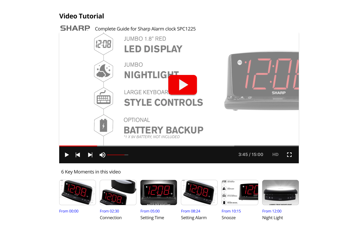
Curated Video Support with Timestamps
Access to YouTube tutorials directly within the page. Key moments are highlighted at the bottom so users can jump straight to the answer for their specific question — no scrubbing required.
Contextual FAQs
Frequently asked questions are surfaced directly alongside the virtual clock, answering the most common queries without requiring a support call.
What Worked
- ↗
Grounding the solution in real Amazon and Target reviews gave the design credibility and focus.
- ↗
The click-based virtual clock let users learn by doing — closely mirroring real-world interaction.
- ↗
Step-by-step contextual guidance reduced cognitive load and addressed the most common confusion points.
- ↗
Integrating video support with timestamps made self-service feel immediate and genuinely useful.
Would Do Differently
- →
Focus more on making interactions intuitive so users can understand key actions with minimal guidance.
- →
Refine visual affordances to reduce reliance on explanatory prompts.
- →
Rely more on natural interaction patterns rather than instructional overlays.
Next Steps
- →
Expand usability testing to a broader and more diverse user group.
- →
Explore progressive disclosure to reduce onboarding dependency.
- →
Measure long-term effectiveness by tracking reduction in customer support inquiries.
- →
Extend the virtual clock approach to other consumer devices with high support demand.
Biggest Learning
Product confusion is directly tied to support burden. What appeared to be a simple physical product became difficult to use because users lacked clear, guided instruction. This project reinforced how digital experiences can serve as effective extensions of physical products — reducing frustration while minimising dependency on customer support.
Next Project