Thesis Capstone · Mobile Design
Usher — AI-Powered Academic Resource App
Bridging the gap between Canvas coursework and university library resources — so students stop Googling and start discovering.
Role
End-to-end UX Design
Timeline
8 Months
Type
Thesis Capstone
Tools
Figma · Miro · ChatGPT · Gemini
Universities invest millions in academic resources. Students still Google everything.
Despite world-class library databases and curated academic collections, students consistently default to Reddit, Google, and unreliable online sources for homework help. This isn't a laziness problem — it's a discovery and navigation problem.
The current system requires students to leave their existing workflow, navigate complex search interfaces, evaluate unfamiliar databases, and decode academic jargon — all before finding a single relevant resource. Usher was designed to eliminate that entire journey.
The Gap
The data revealed a troubling pattern
Before talking to students, I reviewed existing research on how students approach academic work today. What I found set the stage for deeper investigation.
These patterns highlight a growing gap between available academic resources and how students actually search for information — setting the stage for deeper primary research.
Don't redesign the library. Rethink how students access it.
Usher is an AI-powered mobile companion that automatically connects Canvas assignments to library resources — eliminating the search step entirely. Instead of asking students to adapt to complex systems, Usher meets them within their existing academic flow.
Canvas Sync
Direct integration pulls assignment titles, descriptions, and due dates — no manual input required.
AI Matching
Algorithm analyzes assignment requirements and matches library metadata — without students writing a single search query.
Smart Notifications
Push alerts deliver contextual resource recommendations with relevance scores — exactly when students need them.
Mobile-to-Desktop Flow
Discover on your phone, access on your laptop. Email and text links on every resource bridge the gap seamlessly.
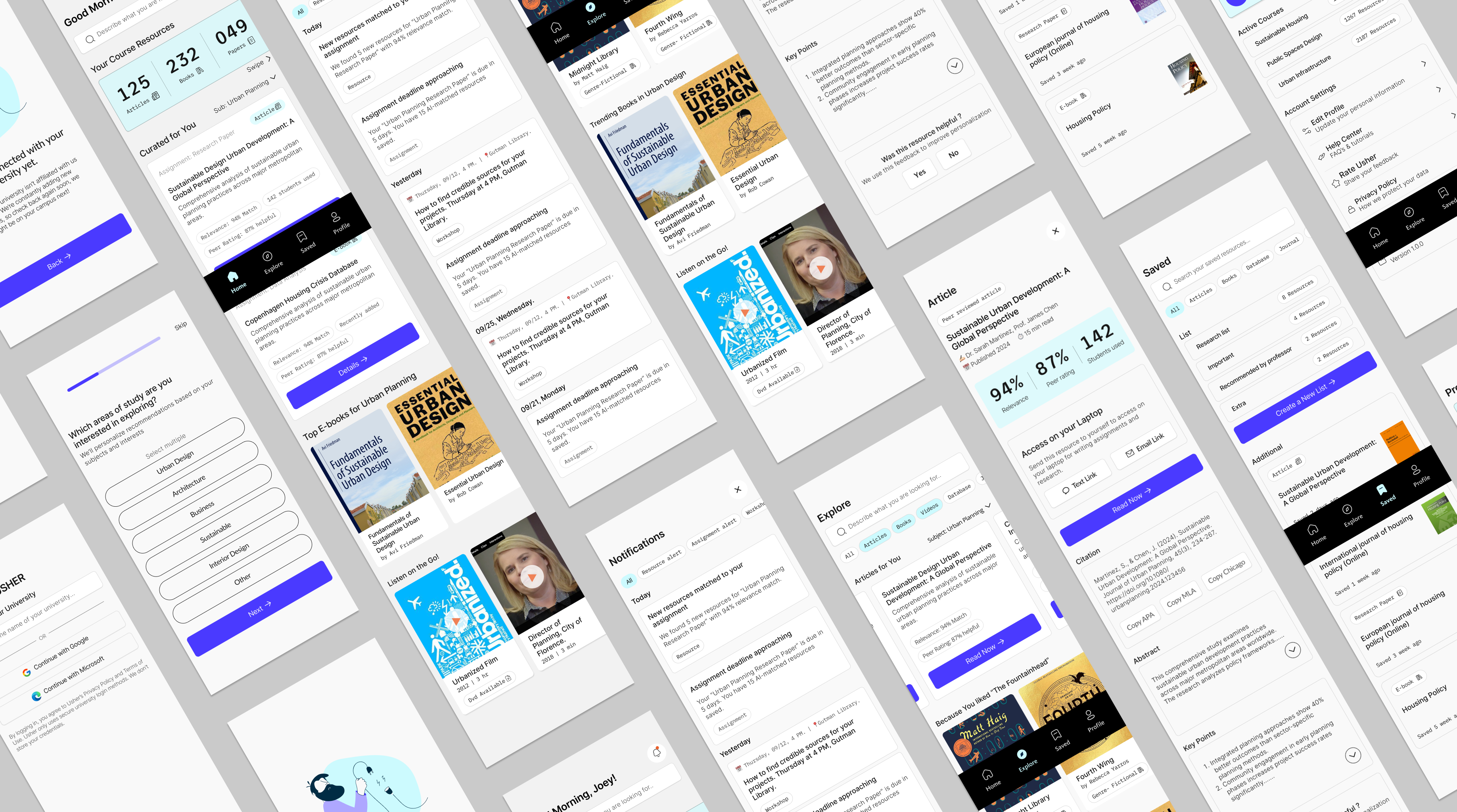
The App in Action
See how Usher removes the friction between students and the resources they need
Prototype walkthrough · Figma
12 students, 8 departments, and one library director
To move beyond assumptions, I conducted in-depth interviews with 12 students across different departments — from Architecture to Medical to UX Design. These conversations revealed not just what students do, but why they avoid library resources despite needing them.
I then shared synthesized findings with the Director of the University Library. This institutional perspective revealed operational constraints I needed to design around — limited IT resources for complex integrations and content licensing restrictions. Together, these dual perspectives formed the foundation for every design decision that followed.
Key Insights
What the research actually revealed
Students use the library for everything except research
Only 2 out of 12 students actively used library literature resources for academic research — the core function libraries are designed for. Both belonged to the Medical program. The majority came for printing, group study, or IT support.
Navigation was the real barrier — not awareness
After mapping student challenges, navigation emerged as the underlying factor — outweighing awareness gaps. Difficulty finding relevant resources and unclear search paths created friction that discouraged continued use. This reframed the entire design challenge.
Student Voices
“To go to the library, it like takes you an effort to walk all the way to the library… time is more valued when you're doing it digitally.”
Participant 2
“I have sometimes spent maybe 1 or 2 hours just finding a book or maybe a thesis… it's time-consuming, so I prefer online.”
Participant 1
“Even the website, it's kind of tricky. We are not able to easily find where the things are… it's very difficult to find out.”
Participant 5
Design Challenge
How might we reduce the navigation friction university students face when trying to discover and engage with credible, course-aligned library resources?
Design
From lo-fi sketches to a polished mobile experience
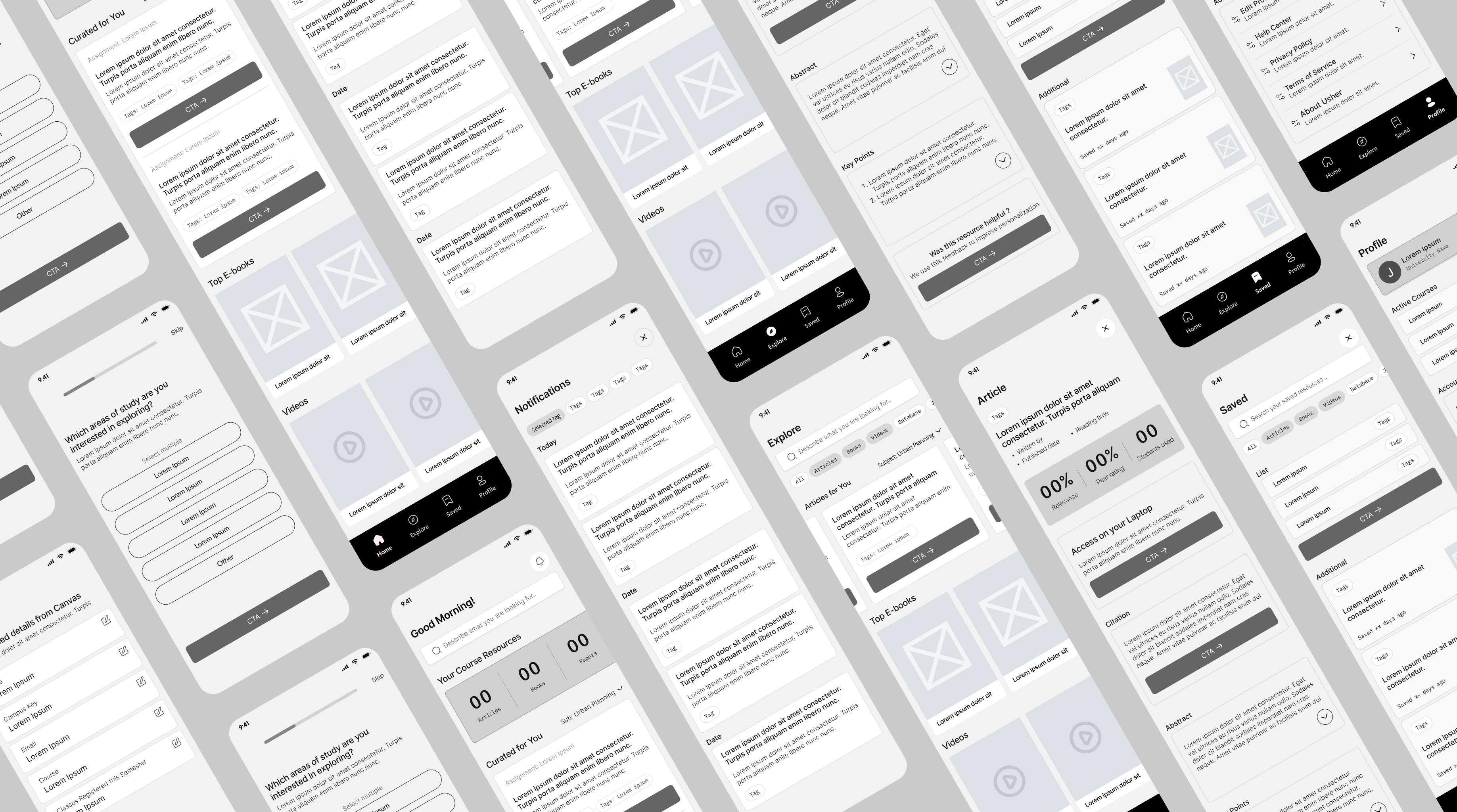
Lo-fi Wireframes
Low-fidelity wireframes helped map navigation patterns, search flows, and core screens before committing to visual polish — validating structure against student mental models from research.
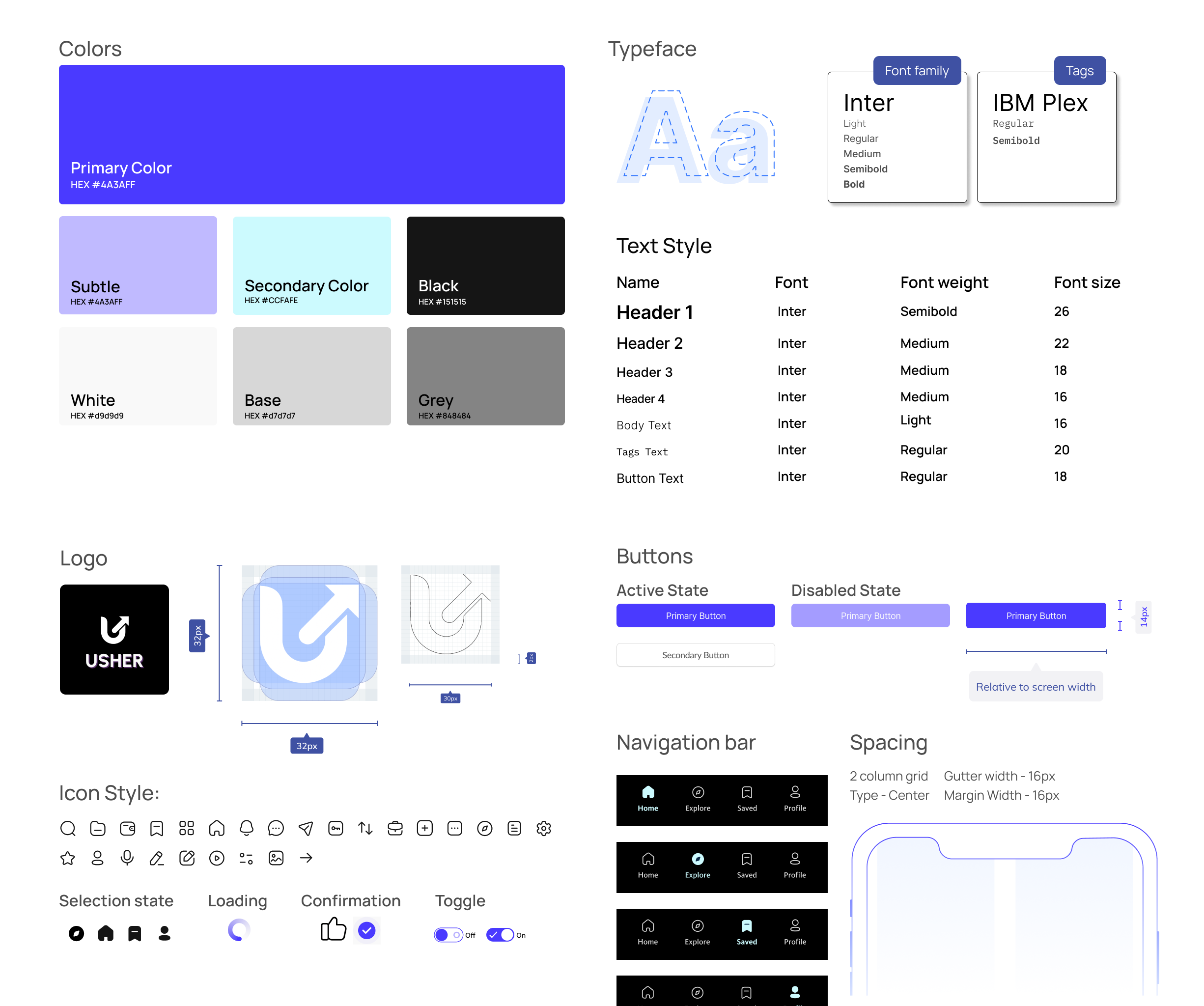
UI Exploration
Defined typography, color, and component patterns for a mobile-first companion that feels academic yet approachable — balancing clarity, trust, and scanability for quick discovery between classes.
Hi-fi Wireframes
High-fidelity screens translated research into tangible interactions — from discovery and handoff to engaging with course-aligned resources — with clear hierarchy, affordances, and a consistent system across key flows.
Design Decisions
Every choice anchored in research
Meet students where they already are
Students live in Canvas to track deadlines and assignments. Instead of expecting them to leave their workflow to search for resources, I designed a mobile-first experience that integrates with their daily habits — the library comes to them, not the other way around.
Why this decision
Students discover resources in micro-moments on their phones but need laptop access for deep research. The seamless mobile-to-desktop handoff bridges discovery to delivery, matching actual behavior patterns revealed in interviews.
Make resource availability visible at a glance
10 out of 12 participants believed there were “no resources” available for their courses — factually incorrect. The interface needed to actively combat this “resource blindness” and prove its value immediately upon login through big quantitative counters (e.g., 232 Books, 125 Articles).
Why this decision
Perception shapes behavior. If students don't believe the library has relevant material, they won't try. High-level metrics serve as immediate visual proof of abundance, validating the library's utility before the student even searches.
Redesign discovery to reduce cognitive load
Initial concepts mimicking traditional database lists were failing — they required too much cognitive effort to parse, causing abandonment before search began. I shifted to a “Netflix-style” discovery model using cover art, horizontal scrolling, and bite-sized descriptions.
Why this decision
Students are accustomed to content-forward browsing patterns from streaming apps. Matching that familiar interaction model lowers the barrier to entry, encouraging exploration rather than intimidation from academic-looking interfaces.
Outcomes
Validated through testing
What Worked
- ↗
Interviewing across multiple departments gave genuinely diverse perspectives, not a narrow sample.
- ↗
Validating student insights with the library director aligned user needs with institutional constraints early.
- ↗
Anchoring every design decision in research prevented solution bias and feature overload.
Would Do Differently
- ↻
Test navigation concepts earlier using low-fidelity prototypes before committing to visual direction.
- ↻
Involve institutional stakeholders sooner to surface technical and operational constraints earlier in the process.
- ↻
Narrow solution scope faster through quicker validation cycles rather than polishing too early.
Next Steps
- →
Expand usability testing with a larger and more diverse student population across universities.
- →
Explore deeper integration with existing academic tools such as learning management systems.
- →
Measure long-term engagement to evaluate whether improved navigation leads to sustained library usage.
Biggest Learning
What initially appeared to be an awareness problem was actually a navigation issue. Deep behavioral analysis revealed that friction in finding relevant resources — not lack of interest — was the primary barrier to library usage.
Next Project
Constant Mobile App
Mobile Design · Habit Design · Wellness